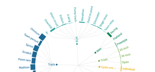
As a big fan of road cycling, and a little bit BMX and MTB, I became curious about what other disciplines exists in cycling. The visualisation below shows the wide range of what cycling on two wheels has to offer. The bars represent the number of events that took place in 2020.
Post Category → Data visualisation
Pluk van de Petteflat infographic
Deze visual maakte ik tijdens de Illustrator cursus die ik gaf aan 1e jaar CMD studenten. De opdracht was om een infographic te maken naar aanleding van het verhaal van Pluk van de Petteflat. Dit was mijn resultaat aan het einde van de les. Continue reading
Podcast kliek
De afgelopen jaren ben ik steeds meer podcasts gaan luisteren. Wat me opvalt is dat het lijkt alsof er steeds vaker dezelfde gasten aanschuiven en dat hosts ook graag bij elkaar achter de microfoon kruipen. Onderstaande data visualisatie bevestigd dit beeld. Dit interactieve netwerk diagram laat alle Nederlandse podcasts zien waarvan de gast/host tenminste 1x ook bij een andere podcast te gast was. Continue reading
De spannendste grote ronde
Deze data visualisatie laat zien welke grote ronde de afgelopen 5 jaar het spannends is geweest qua tijdsverschillen, trui dragers, hoogtemeters en aankomsten berg op.En wat blijkt, Alle edities van de Tour de France van de afgelopen 5 jaar waren minder spannend dan elke andere versie van giro en vuelta. De Vuelta 2018 was de meest opwindende! Continue reading
Chart chooser chart
After reading the handbook for data visaulisation design by Andy Kirk, i got inspired to plot of 25 data visualisation tools that can help to choose the chart for your data visualisation project. Continue reading
Flat races of the Tour de France are boring
The data visualisation below shows why the flat races in the Tour de France are not interesting to look at.
1) someone almost never wins from an escape
2) only 10 sprinters share 49 victories
The road to the podium of the Tour de France
This logarithmic line chart shows how the final top 3 of the last 10 editions of the Tour de France came about. Continue reading
Visualising Data Collection of water points in Mali
For the data collection of water points in Mali by the DNH (Direction Nationale de l’Hydraulique) I created this torque heatmap showing collected data from November 2015 with Akvo FLOW. 25899 points are mapped in two months time.